Starbucks Creamer
Nestle had recently acquired the licensing deal for Starbucks' home products and approached us for their first venture outside of coffee. Their competitor, Dunkin', had already been in the creamer space but their product wasn't living up to the name and Nestle saw potential to take the market share. Since this was the first time in the creamer category the Starbucks' creamers needed to stand out while staying true to the premium quality of the brand.
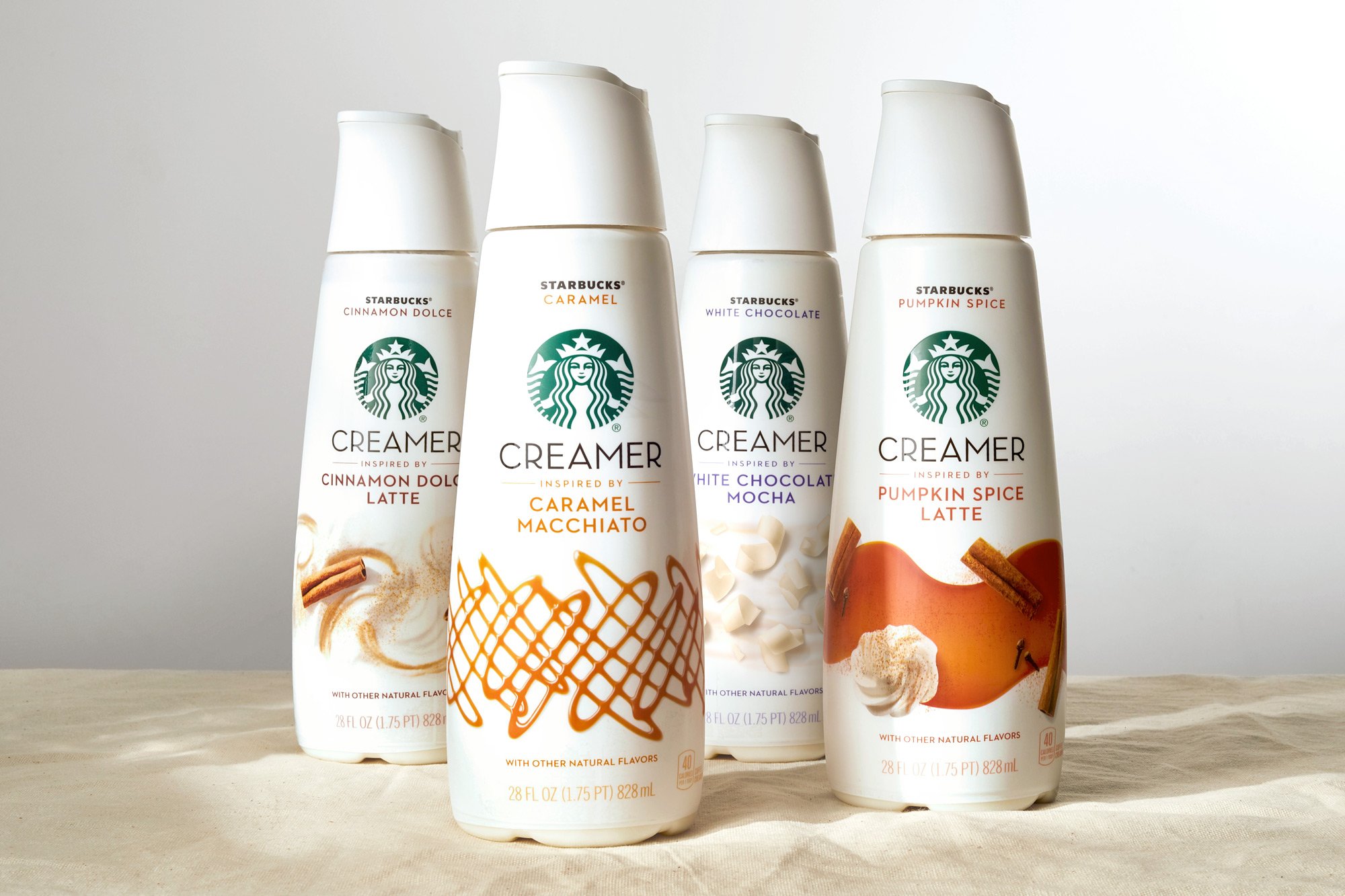
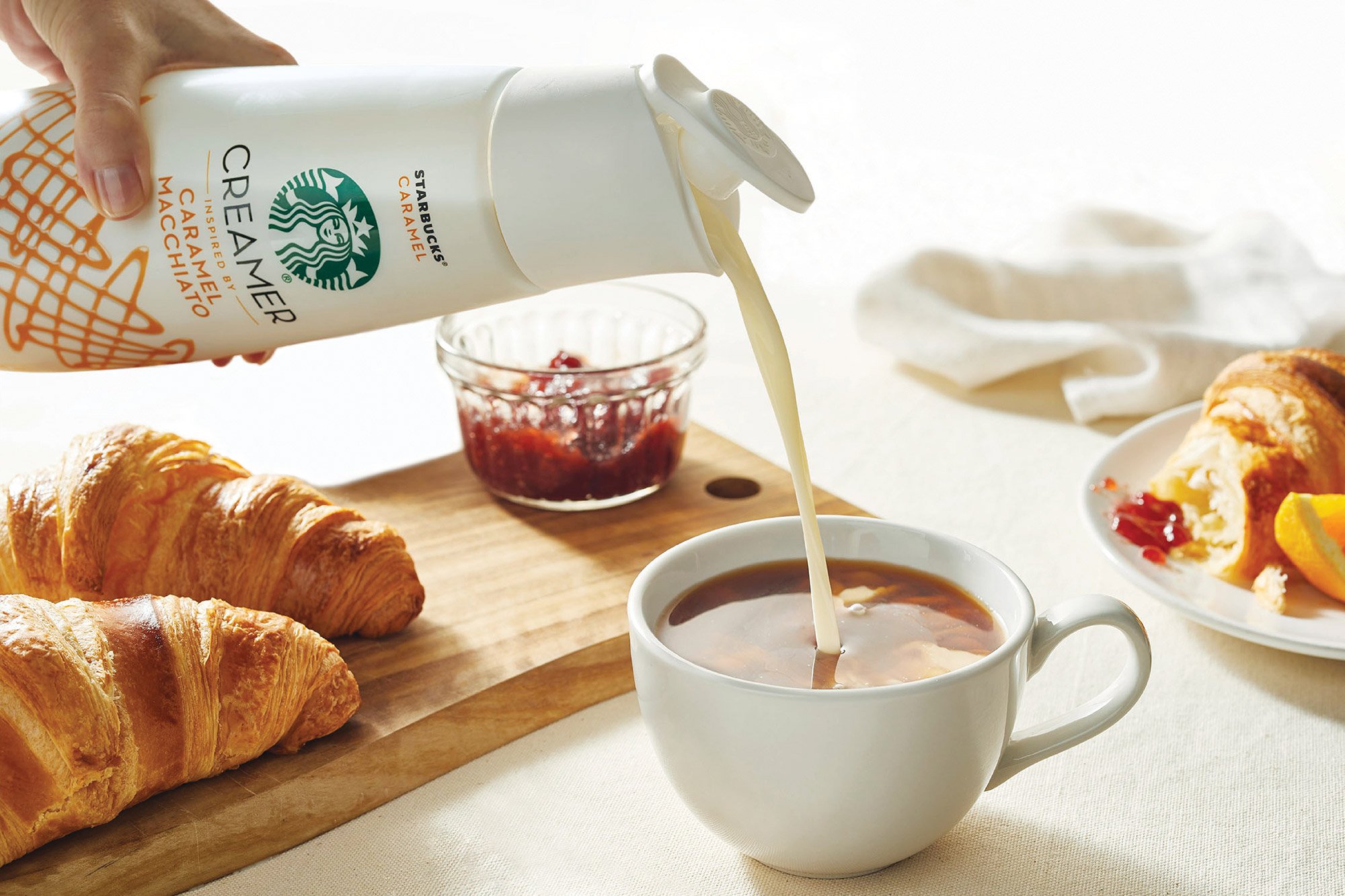
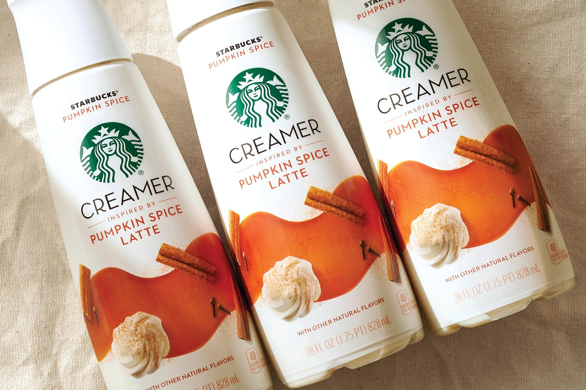
We wanted to build upon the two things that makes Starbucks successful, trust and craving. The first task was easy, taking inspiration from what makes Starbucks so iconically recognizable, the siren. Using the siren in the same way it's used on a city street we drove that same recognition on shelf.
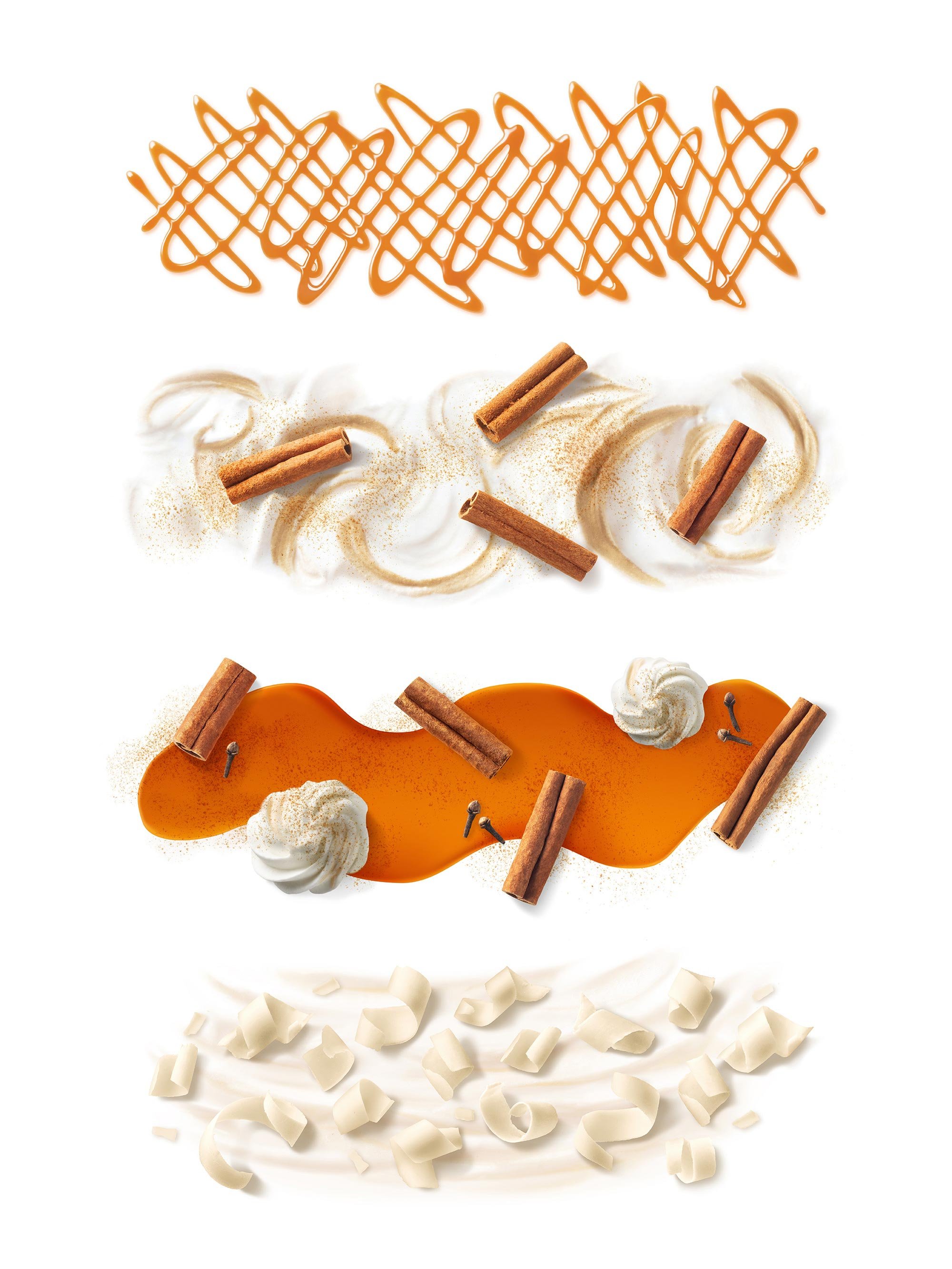
The second task was more of a challenge. Finding success by artfully re-creating the iconic beverages through the artisan perspective of the barista we created photography that is not only flavorful, sensorial and irresistible. When you see it you know you can trust it and want it.
-
Design Direction, Branding, Packaging, Art Direction
-
Design Director, Designer, Art Director
-
Sterling Brands
-
Francesco Tonelli